Session Outline
„A picture is worth a thousand words“ – well, that is especially true when it comes to analyzing data. Visualization is the quick and easy way to uncover the big ‘picture’ in your data. This session goes to show you how lots of compelling visualizations can be produced in the R language with the help of the ggplot2 package and friends – and their usual small effort of coding.
Key Takeaways
- Even with open-source products like R it is possible to produce compelling data visualizations
- Applying the Tidyverse philosophy and tools, it is easy to accomplish this with really little effort of coding
- But – even in this context – sometimes less is more
————————————————————————————————————————————————————
Speaker Bio
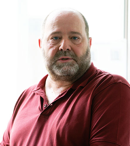
Thomas Hütter – Senior Developer | Swecon Baumaschinen
Thomas holds a degree in Business Economics, but has been a data explorer and a developer at heart ever since the days of dBase and Turbo Pascal. He touched his first SQL Server at V6.5 and used covering indexes before they became a feature. Thomas has been developing in Navision/Dynamics/Business Central systems for quite some time (since 2001, one year before MS acquired Navision), joined PASS in 2006 and got his hands on R in 2014 (the year before MS bought Revolution Analytics). He has worked for ISVs as well as end-user companies, as a developer, consultant, accidental DBA and is an author for data-related articles as well as a speaker at data events across Europe.

Day 2 | M2 | Analytics and Visualisation
Thomas Hütter – Senior Developer | Swecon Baumaschinen
